Friday, December 22, 2006

Dee-Filosofi Kopi

… ‘Itu yang membuat saya mencintai minuman ini. Kopi itu sangat berkarakter.’
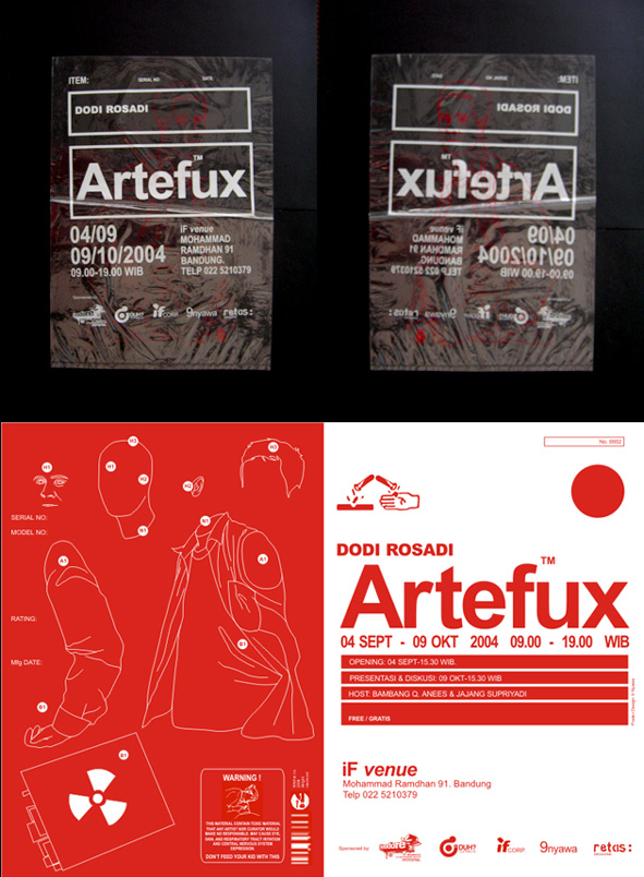
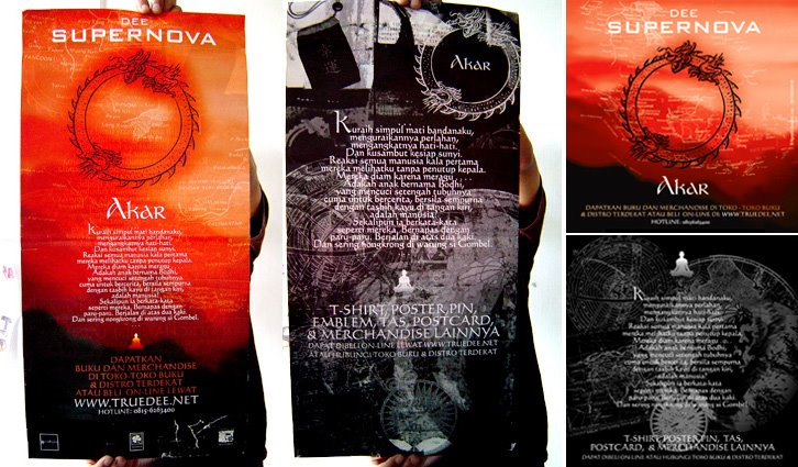
Kudengar sayup-sayup Ben berkata pada salah satu pengunjung perempuan yang duduk di bar …
Dee – Filosofi Kopi, page 4.


'Kopi Tubruk' Version


Black Version.


Process:
I’am a coffee addict and couple years ago owned a small coffeeshop in Bandung. So, this project give me quite strong memories, research materials and also perspective(s) about coffee culture, products & imagery.
Dee, as usually, wanted a simple one. A book cover that could easily recognized and related with coffee & ‘Philospohy’, as well as it could stand out from the crowd of the bookshelf. So, after some research, several ideas came from scratch.
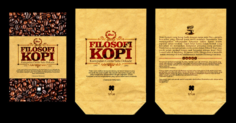
This idea taken a form of the book as coffee package set with specific coffee images, materials and easily identified logo. A simple ones. Just like when we bought coffe from small old coffeshop. ‘Cheap paper’ packaging, old typography and old colors schemes. I wish I could add some coffee smell on it.


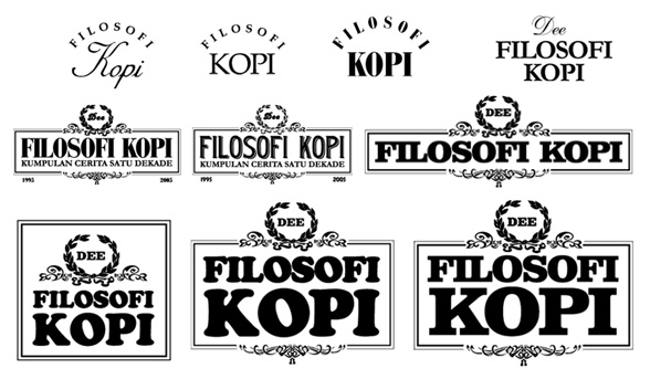
These are typographic studies for the book logo. A classic and decorative one which fit the format was selected.


We discussed this idea for a while. There’re absolutely no problem with graphics, but the coffee book package seem to be a good idea to cut off. It’s production & distribution didn’t match partners (Gagas Media publisher & distributor) effieciencies. So, there’s only left these alternatives.


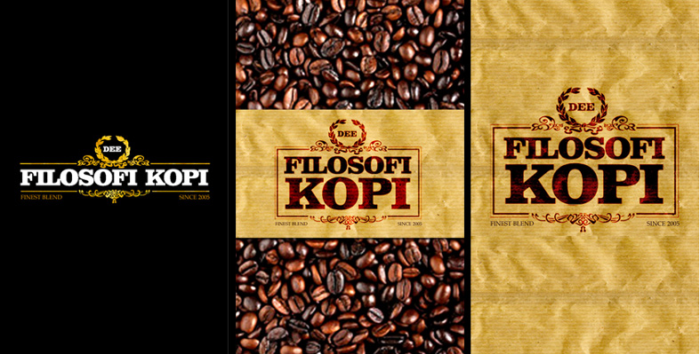
Finally there’re two selected covers. The black (allover) one, and the ‘Kopi Tubruk’ one. The Black one would be bitter and sharp as espresso, meanwhile the other seem to be more realistic. Just like anyother traditional handmade coffee. Whatever you choose, hope it could fit the friendship, restless works, long conversation - the morning, evening and the rush nights of your coffeelife.
Read more!

Thursday, December 14, 2006

Rough Days

Ugh. It's been a rough days. Perubahan cuaca, deadline(s), kesehatan, dan urusan lain (Blog ini jadi ga keurus). Ada beberapa grafik yang saya bikin sewaktu terjebak di rough days dan sakit flu yang kontemplatif sekitar seminggu yang lalu.

Pixel, lines, rain, lines...


Read more!

Tuesday, November 07, 2006

idn SG Wants You !

Ada tawaran dari Idn Mag SG, buat yang mau ngirim karya langsung aja kirim ke brian (infekt), email :infekt_design@yahoo.com. Bisa juga taro alamat e-mail ke kotak surat saya (lihat bagian profile) nanti saya forward formulir yang sudah Brian siapin. Ok. Ditunggu (Via Handono Chen).
Read more!

Pengen bikin studio desain sendiri ? Baca dulu yang satu ini

Mary Beth & Paul Trautwein punya tips khusus buat teman-teman yang kadung kepincut buat jadi freelancer atau kepengen punya studio sendiri. Klik saja ke about.com, ada banyak materi lain tentang desain dan desain grafis. Dari mulai teknik networking, alamat komunitas, definisi, sampai beberapa resource. Ga terlalu spesifik, tapi mudah-mudahan bisa bermanfaat. Sementara itu model-model start up business kit bisa dipelajari lewat sample-sampel di bplan & mplan (software khusus buat develop business & marketing plan). Pastinya masih banyak materi tambahan kalo mau nyari di web. Anyway.

Fenomena intrepreneurship di desain ini sebetulnya sangat menarik buat disimak lebih intens. Peningkatan populasi peminat ( yang mungkin sudah jauh melebihi tingkat populasi di tahun 80/90an), dan kualitasnya kayaknya sangat berhubungannya sama pergeseran ‘peta’ desain industri di tingkat mikro ato makro yang udah kejadian sekarang ini. Saya lagi ngeluangin lebih banyak waktu buat observasi, mudah-mudahan artikel khusus tentang ini bisa rampung cepet-cepet. Tapi sementara itu, saya juga pengen tau respon teman-teman yang lain tentang kondisi ini, dan juga tentu saja materi-materi yang saya referensikan. Jadi, jangan lupa kasih feedback kesini yak. Enjoy.

Read more!

Friday, November 03, 2006

Better Look

I will not stop to notice you that this site will look better on Internet Explorer. Thanx. Read more!

Thursday, November 02, 2006

Dodi Rosadi Artefux


Another old work of mine. Silk screened piece for one of my favourite local artist: Dodi Rosadi.


Limited edition promotional - collectable suggested - poster. Wrapped with transparent plastic (that could easily separated or mounted together) to highlight the issue; Artef-act/ux. Bellow is the invitation kit. The card actually made from wasted paper.


You can check Dodi recent works on: www.odoygiant.multiply.com. Hope you like ‘em. Read more!

Friday, October 06, 2006

Dee Supernova Petir

Here's another classic cut out cover we made for Dee Supernova Petir.


Process:
Compare with other Supernova releases, we think Petir is the most modest and simplest one. There’s only Electra Wijaya, a girl with electricity, with not so many geographic, culture & scientific overlaps. Maybe that’s way the story goes so focused, clear and strong. I don’t know. Perhaps, I just an ordinary reader and fans.

We aremoving our office when we do this project. So, we’re messing on the topics, ideas, and also; furnitures ;-). Thankfully, there’re backups from Jimmy & Iwan, a couple of sweet college residency designers.

As you could guess, there’d never been White for Supernova. The cover is black all over.


Blue would be the additional schemes to distinguish it from other Supernova (Akar had use Red).


There’re several image & composition research, until Dee agree to pick the most unique. One with cut off and overlap images.


There's Jimmy with cover dummy.


Team for this project: Andry Moch, Jimmy and Iwan. Thanx Folks.

Read more!

Dee Supernova Akar redesigned


The cover. Front and back.

Vertical Poster & Fliers (Front & Back).

Horizontal poster, back. Developed by Akbar.

Process:

After clashed by local religious community, Dee and management (Erwinton) decide to rebuilt the cover and also add more marketing & promotional strategic. So, there’d be most massive design project of Supernova. We read a lot of book, do online research, and also make long conversation with local tattoo artists; Kent Tatto (thx). The redesign concept of the cover turn out very simple. Remove the Ohm symbol, maintain the old version as well as developed it to have more artistic exploration. We actually suggested some holographic or reflective material to replace Ohm symbol, so reader their own face. Erwinton came with the simplest - cut it out with a hole.

There’re quite strong ambitious for book merchandise. So we developed a lot of graphic experiments, including manual cut n paste, drawing, painting, as well as photo (and photocollages).

Bellow is preliminary sketch for poster design.

Bellow is a cut from fake newspaper we use in poster.

This was the flyer design sketch.

Read more!

Saturday, September 16, 2006

Better Look

I will not stop to notice you that this site will look better on Internet Explorer. Thanx. Read more!

Friday, September 15, 2006

iFvenue-splash series


Silk Screened Launching Poster.


Tshirt graphics


Business Card and - anyone want Sticker (set) ?


Where are all of those splash came from

Read more!

Orkes Karembong Kayas


Silk Screened A1 Poster and Vinyl sticker for local band called Orkes Karembong Kayas.


And here are some study


Read more!

Saturday, September 02, 2006

Scenethetics series


In about May 2006, I held Scenethetics, a small workshop with students at local university.Co-joined by local talent that has marked their community with visual aesthetics works - such as Ucok (graphic), Frans (photo) and Deni Nugraha (retail). Read more!