
The cover. Front and back.
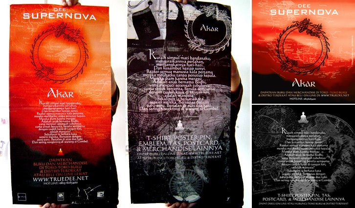
Vertical Poster & Fliers (Front & Back).

Horizontal poster, back. Developed by Akbar.
Process:
After clashed by local religious community, Dee and management (Erwinton) decide to rebuilt the cover and also add more marketing & promotional strategic. So, there’d be most massive design project of Supernova. We read a lot of book, do online research, and also make long conversation with local tattoo artists; Kent Tatto (thx). The redesign concept of the cover turn out very simple. Remove the Ohm symbol, maintain the old version as well as developed it to have more artistic exploration. We actually suggested some holographic or reflective material to replace Ohm symbol, so reader their own face. Erwinton came with the simplest - cut it out with a hole.
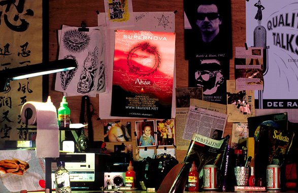
There’re quite strong ambitious for book merchandise. So we developed a lot of graphic experiments, including manual cut n paste, drawing, painting, as well as photo (and photocollages).

Bellow is preliminary sketch for poster design.

Bellow is a cut from fake newspaper we use in poster.

This was the flyer design sketch.

wow!
ReplyDeleteeh bos, email "no-comment@blogger" mah teuing bisa dipake keur ngaemail teuing hanteu! mun ngaemail ka sayah mah geus weh ka ataganteng@yahoo.com
masih OL teu, add guah di YM donks! ataganteng@yahoo.com! sok gera cobaan!
weitts.....apa kabar bung fahmi, long time no see yak...mash eksisi ngurusin dee nih, sip..sip...
ReplyDelete