
Read more!


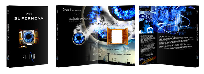


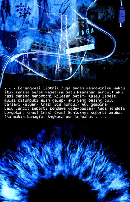
There’re several image & composition research, until Dee agree to pick the most unique. One with cut off and overlap images.
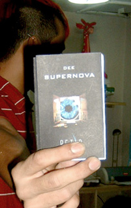
There's Jimmy with cover dummy.
Team for this project: Andry Moch, Jimmy and Iwan. Thanx Folks.
Read more!

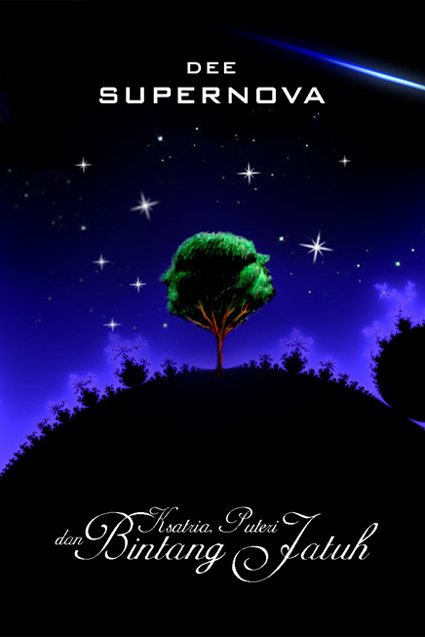
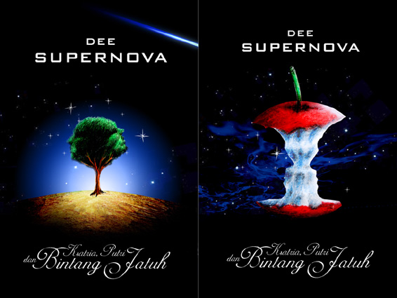
The cover. Front and back.
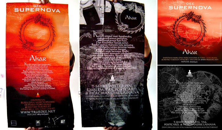
Vertical Poster & Fliers (Front & Back).

Horizontal poster, back. Developed by Akbar.
Process:
After clashed by local religious community, Dee and management (Erwinton) decide to rebuilt the cover and also add more marketing & promotional strategic. So, there’d be most massive design project of Supernova. We read a lot of book, do online research, and also make long conversation with local tattoo artists; Kent Tatto (thx). The redesign concept of the cover turn out very simple. Remove the Ohm symbol, maintain the old version as well as developed it to have more artistic exploration. We actually suggested some holographic or reflective material to replace Ohm symbol, so reader their own face. Erwinton came with the simplest - cut it out with a hole.
There’re quite strong ambitious for book merchandise. So we developed a lot of graphic experiments, including manual cut n paste, drawing, painting, as well as photo (and photocollages).

Bellow is preliminary sketch for poster design.

Bellow is a cut from fake newspaper we use in poster.

This was the flyer design sketch.


Silk Screened Launching Poster.
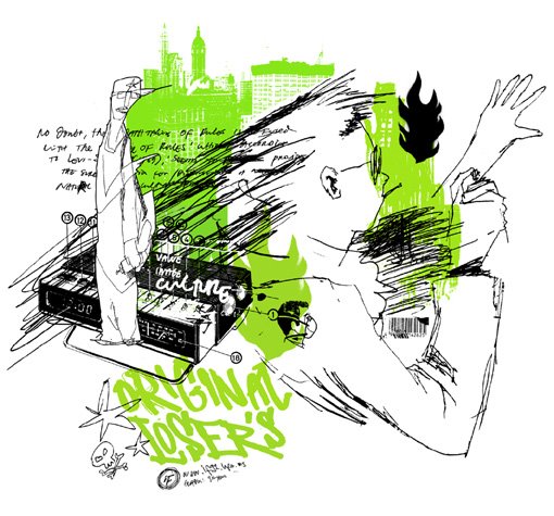


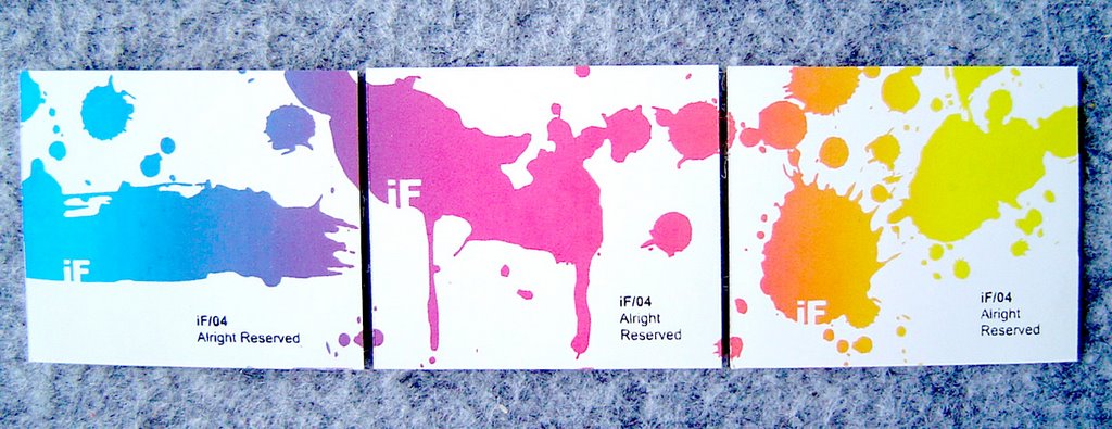
Business Card and - anyone want Sticker (set) ?

Where are all of those splash came from
Read more!


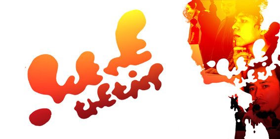
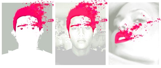
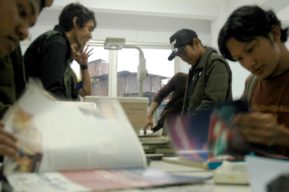
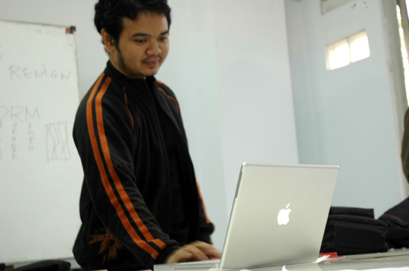


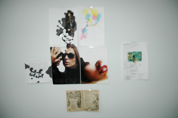
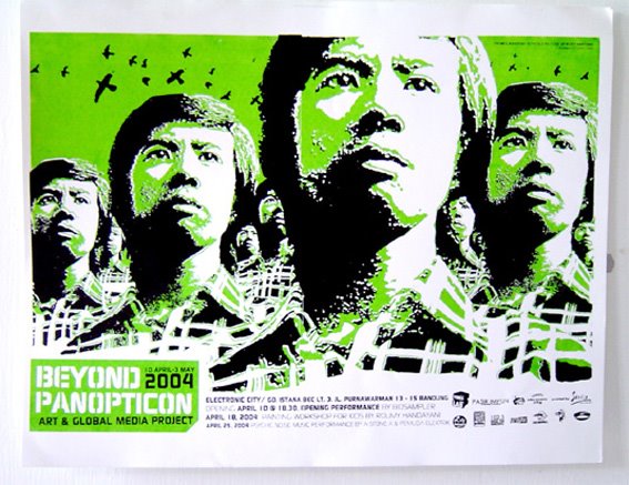


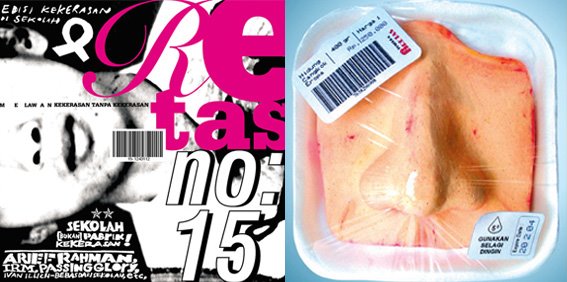
Retas is a magazine developed by IRM (one of Indonesia Youth Community) to gain awareness and reduce violence, specifically urban youngster. When I was invited to co-joined creative and aesthetic direction, I stuck on the controversy of the idea that ‘direction’and/ or aesthetic sensation definitely would be pushy an interpretate as violence instrumen for each one of other team member - as well as to our readers, on other side, if we prefer not to do such thing violating things, we couldn’t think about how boring the zine would be. This is why we decide to have the organic design approach. The set that could allow every designer, artists (and readers too) develop their personal approach (in format, design process, graphic elements, etc). As wide as possible, as well as we constantly developed collective understanding about the benefit we could achieve. It is not just how to transfer each theme into unexpected effective form, but also how we could managing feedbacks. Technically we got cut outs graphics, experimenting with 4 different cover (for one issue-no 19), manual cut+paste layouts, multi layeres typos, photography symbolism exploration, collaborate with some local talented artists, etc. The result was something we never have seen or experienced before.
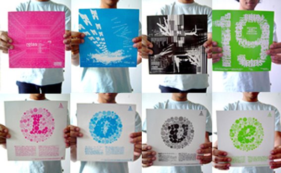
Some our readers complain about how the magazine has violating their reading habits. Some other notes great support, that the violence phenomenon would be (again) far from notice if we chose a conventional approach. We have so many discussion about that. Even until now, couple years after the zine closed, readers opinions never run out. Obviously there’re a lot of new thing we’ve learn from the process. So, Retas readers too. Enjoy.