Showing posts with label Works. Show all posts

Wednesday, October 22, 2008

Read or Die Program


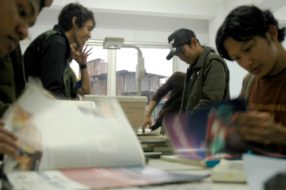
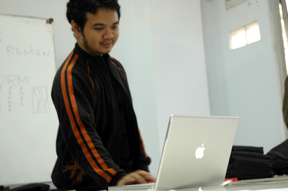
Gak kerasa, sudah dua bulan berlalu sejak Mampetide Syndroma alias Sindrom Sulit Beride terjadi di NLG Studio. Situasi penuh kefrustasian yang justru menjadi latar belakang inisiasi program Read or Die. Tidak seseram judulnya. RoD adalah program semacam klab baca dan diskusi buku. Satu minggu sekali, secara bergiliran dipilih satu buku untuk dibaca oleh setiap staff. Hasil bacaan tersebut kemudian direview, dipresentasikan dan didiskusikan di sesi khusus. Biasanya sih hari Jum'at, after hours tentunya.

Alhamdulillah, hasilnya kini sudah mulai terasa. Meskipun memang ide-ide tidak pernah turun kayak hujan, tapi karena program ini kita 'terpaksa' musti banyak baca, banyak ngobrol. Walhasil, pengetahuan dan skill juga bertambah terus. Pastinya ini positif. Mudah-mudahan bisa lebih tekun lagi.

Klik disini untuk mengikuti perjalanan Read or Die.
Read more!

Friday, November 09, 2007

Subforms


Whoa... Baru sekarang posting lagi sejak password account saya hilang (Damn!). Karya-karya terbaru. Sebagian dikerjakan bersama Jino. Liat lebih lengkap di blog SubForms

Read more!

Friday, December 22, 2006

Dee-Filosofi Kopi

… ‘Itu yang membuat saya mencintai minuman ini. Kopi itu sangat berkarakter.’
Kudengar sayup-sayup Ben berkata pada salah satu pengunjung perempuan yang duduk di bar …
Dee – Filosofi Kopi, page 4.


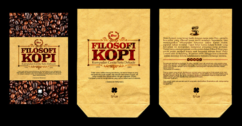
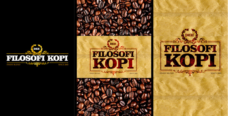
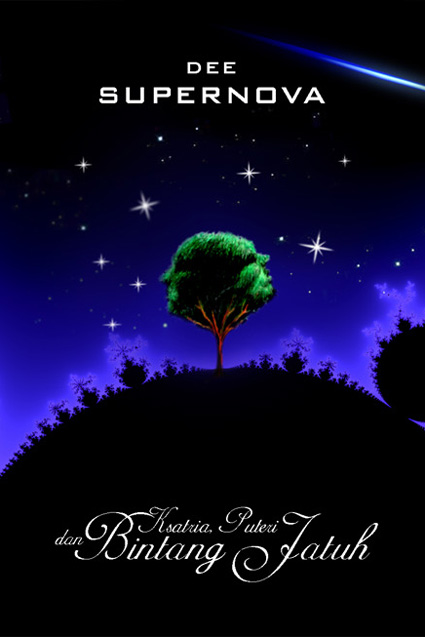
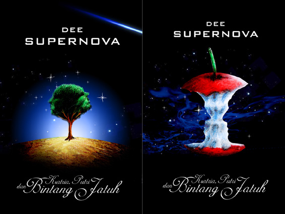
'Kopi Tubruk' Version


Black Version.


Process:
I’am a coffee addict and couple years ago owned a small coffeeshop in Bandung. So, this project give me quite strong memories, research materials and also perspective(s) about coffee culture, products & imagery.
Dee, as usually, wanted a simple one. A book cover that could easily recognized and related with coffee & ‘Philospohy’, as well as it could stand out from the crowd of the bookshelf. So, after some research, several ideas came from scratch.
This idea taken a form of the book as coffee package set with specific coffee images, materials and easily identified logo. A simple ones. Just like when we bought coffe from small old coffeshop. ‘Cheap paper’ packaging, old typography and old colors schemes. I wish I could add some coffee smell on it.


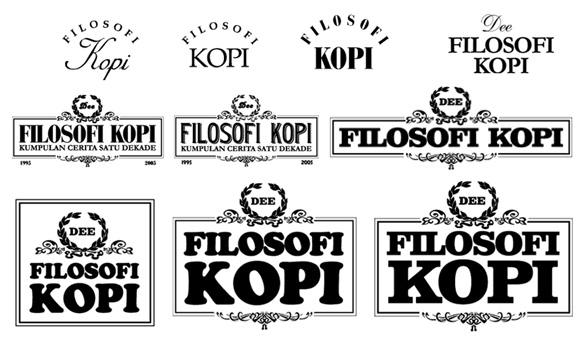
These are typographic studies for the book logo. A classic and decorative one which fit the format was selected.


We discussed this idea for a while. There’re absolutely no problem with graphics, but the coffee book package seem to be a good idea to cut off. It’s production & distribution didn’t match partners (Gagas Media publisher & distributor) effieciencies. So, there’s only left these alternatives.


Finally there’re two selected covers. The black (allover) one, and the ‘Kopi Tubruk’ one. The Black one would be bitter and sharp as espresso, meanwhile the other seem to be more realistic. Just like anyother traditional handmade coffee. Whatever you choose, hope it could fit the friendship, restless works, long conversation - the morning, evening and the rush nights of your coffeelife.
Read more!

Thursday, December 14, 2006

Rough Days

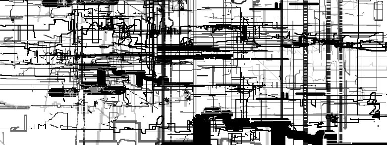
Ugh. It's been a rough days. Perubahan cuaca, deadline(s), kesehatan, dan urusan lain (Blog ini jadi ga keurus). Ada beberapa grafik yang saya bikin sewaktu terjebak di rough days dan sakit flu yang kontemplatif sekitar seminggu yang lalu.

Pixel, lines, rain, lines...


Read more!

Thursday, November 02, 2006

Dodi Rosadi Artefux


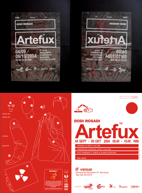
Another old work of mine. Silk screened piece for one of my favourite local artist: Dodi Rosadi.


Limited edition promotional - collectable suggested - poster. Wrapped with transparent plastic (that could easily separated or mounted together) to highlight the issue; Artef-act/ux. Bellow is the invitation kit. The card actually made from wasted paper.


You can check Dodi recent works on: www.odoygiant.multiply.com. Hope you like ‘em. Read more!

Friday, October 06, 2006

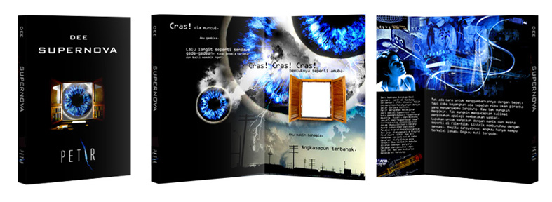
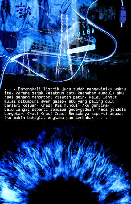
Dee Supernova Petir

Here's another classic cut out cover we made for Dee Supernova Petir.


Process:
Compare with other Supernova releases, we think Petir is the most modest and simplest one. There’s only Electra Wijaya, a girl with electricity, with not so many geographic, culture & scientific overlaps. Maybe that’s way the story goes so focused, clear and strong. I don’t know. Perhaps, I just an ordinary reader and fans.

We aremoving our office when we do this project. So, we’re messing on the topics, ideas, and also; furnitures ;-). Thankfully, there’re backups from Jimmy & Iwan, a couple of sweet college residency designers.

As you could guess, there’d never been White for Supernova. The cover is black all over.


Blue would be the additional schemes to distinguish it from other Supernova (Akar had use Red).


There’re several image & composition research, until Dee agree to pick the most unique. One with cut off and overlap images.


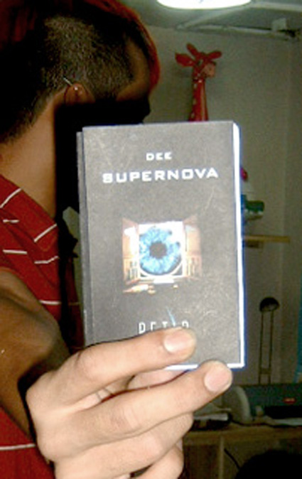
There's Jimmy with cover dummy.


Team for this project: Andry Moch, Jimmy and Iwan. Thanx Folks.

Read more!

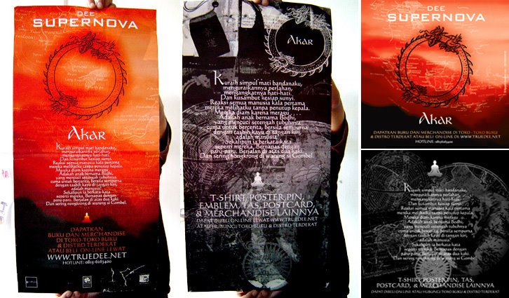
Dee Supernova Akar redesigned


The cover. Front and back.

Vertical Poster & Fliers (Front & Back).

Horizontal poster, back. Developed by Akbar.

Process:

After clashed by local religious community, Dee and management (Erwinton) decide to rebuilt the cover and also add more marketing & promotional strategic. So, there’d be most massive design project of Supernova. We read a lot of book, do online research, and also make long conversation with local tattoo artists; Kent Tatto (thx). The redesign concept of the cover turn out very simple. Remove the Ohm symbol, maintain the old version as well as developed it to have more artistic exploration. We actually suggested some holographic or reflective material to replace Ohm symbol, so reader their own face. Erwinton came with the simplest - cut it out with a hole.

There’re quite strong ambitious for book merchandise. So we developed a lot of graphic experiments, including manual cut n paste, drawing, painting, as well as photo (and photocollages).

Bellow is preliminary sketch for poster design.

Bellow is a cut from fake newspaper we use in poster.

This was the flyer design sketch.

Read more!

Friday, September 15, 2006

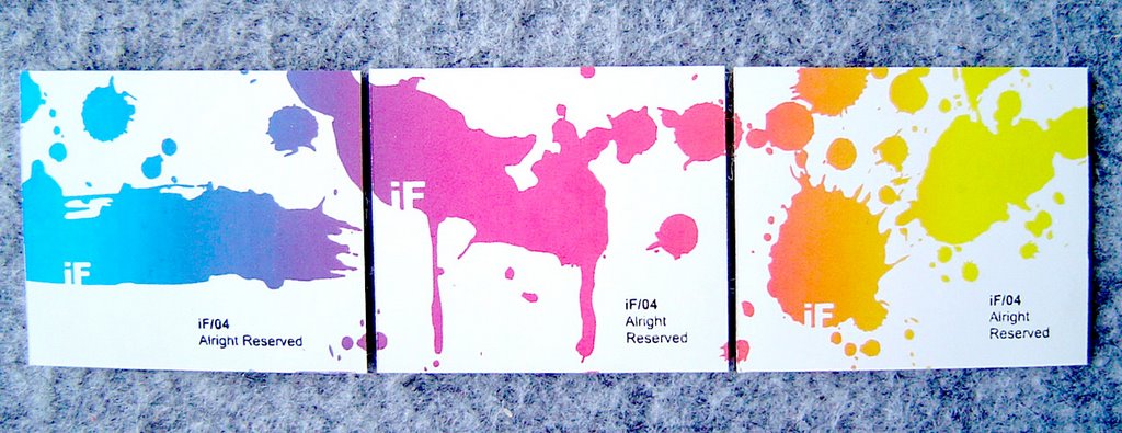
iFvenue-splash series


Silk Screened Launching Poster.


Tshirt graphics


Business Card and - anyone want Sticker (set) ?


Where are all of those splash came from

Read more!

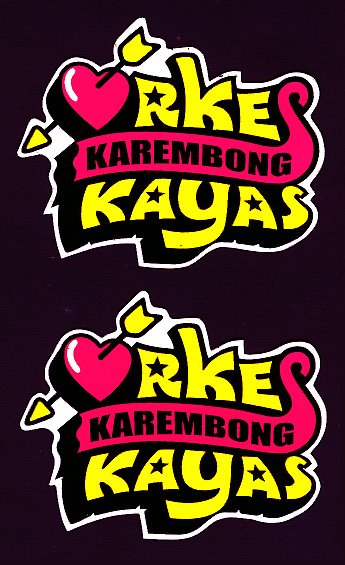
Orkes Karembong Kayas


Silk Screened A1 Poster and Vinyl sticker for local band called Orkes Karembong Kayas.


And here are some study


Read more!

Saturday, September 02, 2006

Scenethetics series


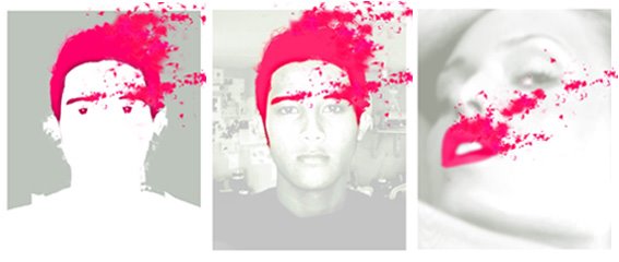
In about May 2006, I held Scenethetics, a small workshop with students at local university.Co-joined by local talent that has marked their community with visual aesthetics works - such as Ucok (graphic), Frans (photo) and Deni Nugraha (retail). Read more!